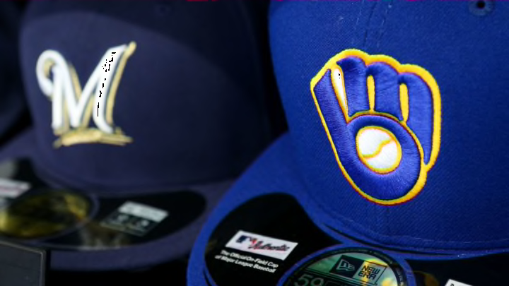
The Milwaukee Brewers launched their celebration of 50 years in Milwaukee with a bang, introducing a new logo and fresh new uniforms.
It was a night of celebration and excitement. The Milwaukee Brewers have announced a rebrand on their on-field uniforms and have a new set of logos.
The capital ‘M’ with the wheat underneath is no more. The script ‘Brewers” with the wheat, also gone.
But what’s in, is a classic look that is familiar to many Brewers fans.
The Primary Logo
It’s what we’ve all been waiting for. The classic “ball-and-glove” logo makes it’s return.
— Reviewing the Brew (@ReviewngTheBrew) November 19, 2019
The name ‘Milwaukee Brewers’ is written around the ball and glove, giving a slightly different logo than the one from the 1980s, but the main part of the logo is still the ball and glove.
But that wasn’t the only new logo revealed tonight. Four other alternate logos were included. Among them was a ball and glove logo just by itself, a refreshed Barrelman, and two completely new logos.
Full slate of logos revealed tonight pic.twitter.com/7aZa6HDHbJ
— Reviewing the Brew (@ReviewngTheBrew) November 19, 2019
The Barrelman, according to owner Mark Attanasio, has a little bit of a tougher look to him this year. When he was brought back as a mascot and was used as a logo for merchandise in the past few years, he looked very friendly. Attanasio didn’t want him to be nice and friendly as a logo for on-field jerseys. So he toughens up a bit for his on-field self.
The second logo from the right encompasses the outline of the state of Wisconsin, which Attanasio said keeps the team’s home as a part of the logo. It’s an homage to the state and the cream look makes sense for The Cream City.
The logo on the far right is rather simple, but also one I really like. A baseball with two wheat stalks as the seams on the baseball continues to pay homage to the beer industry that has played such a huge role in Milwaukee’s history and keeps a piece of the team’s most recent logo involved as well.
The New Uniforms
With Nike taking over as MLB’s jersey supplier, there was going to be at least a minor change to the Crew’s uniforms anyways with the swoosh being added to the front. But the Brewers did a whole redesign.
Clear look at the 4 new #Brewers uniforms @UniWatch pic.twitter.com/KmB534iAmE
— Reviewing the Brew (@ReviewngTheBrew) November 19, 2019
With Ryan Braun, Brandon Woodruff, Brent Suter, and Keston Hiura as the models, the Milwaukee Brewers displayed the team’s new on-field uniforms for this season and beyond.
Braun displayed the main home jersey, which is cream-colored, and has the team’s 50th anniversary patch on the right arm. The cream pants along with the striping down the side of the leg paired with the cream top makes for a classic look.
Woodruff was modeling the home alternate jersey with the pinstripes and block lettering of ‘Brewers’ across the chest. While personally Woodruff wasn’t the biggest fan of the pinstripes, he did say the new jerseys were light and quite comfortable.
Suter had the road navy uniforms. While many would have liked the powder blues to make a comeback, it was not meant to be. However, these jerseys are quite nice. This is the only uniform without the block lettering, using an old school script ‘Milwaukee’ across the chest along with gray pants.
Lastly, Keston Hiura modeled the road gray uniforms that will be the primary road uniform for the club. It’s kind of a basic look that doesn’t have too much flash and isn’t too much different from the team’s old road grays outside of the change in font type for the lettering and numbers.
All the hats will have the ball and glove logo on them with three of the four being solid navy blue. The road navy jerseys have gold front panels on the hat with the ball and glove.
A New Era
During Mark Attanasio’s address, he mentioned previous times he thought about changing the logo, including shortly after he bought the team, and again in 2015 as they began a rebuild and a rebranding made sense.
But it was then that they looked towards the team’s 50th anniversary season as the right time for a rebrand. They were expecting to start being competitive around that time, and as Attanasio admitted, that competitiveness happened a little earlier than anticipated, which he has no problem with.
This is not a one-year thing just for the 50th anniversary. This is the present and future for this club on the field.
Attanasio left no doubt about his intentions and how he wants to introduce a new era in Milwaukee where winning is the expectation, saying “We’re looking to win the World Series in this ball-and-glove”.
The Brewers brought out all the stops for this event, bringing out Bud Selig, Bob Uecker, Rollie Fingers, Cecil Cooper, and many more to help introduce the new logos and uniforms. While the look is new and fresh, it’s not unfamiliar and it’s something that Brewers fans can easily see representing their favorite team well.
